
I’m a UX Designer focused on creating tools that empower by aligning with real human needs. With a background in social sciences, I bring a systems lens to how design supports behavior in complex spaces like healthcare.
ACCESSIBILITY CHAMPION
AI TOOLS
DESIGN SYSTEM EXPERT
PRODUCT DESIGN
CLINICAL
CONSUMER-FACING
PLATFORM
STRATEGY & GOVERNANCE
BOOK WORM
MUSICIAN
ALGORITHMIC ARTIST
WRITER


PRODUCT
CLINICAL
PLATFORM
STRATEGY & GOVERNANCE
Overview
Clinicians were switching between up to ten different tools to complete routine tasks. The system was fragmented, unintuitive, and burdensome— slowing decisions and increasing risk for patient care.
Role: Lead UX Designer
Duration: 6 months
Background: The Optum Clinical Platform offers a modular suite of healthcare solutions and services that our clients can customize to address their specific use cases and workflows.
Evidence
I don’t need more functionality— I just need to do my task in fewer clicks.

Fragmented Information Access: Nurses must navigate across multiple pages and products to find relevant member data, causing inefficiency and cognitive load.
Loss of Context While Documenting: Clinicians can’t reference the Care Plan or member information while entering notes, disrupting workflow and increasing the risk of errors.
Obstructive UI Elements: The call modal and side sheets block critical information needed to complete tasks, forcing users to work around the interface.
Inconsistent Design Patterns: Some products are outdated and no longer align with the Netra Design System, leading to visual and interaction inconsistencies across the experience.

Research
I conducted user interviews, shadowed workflows, and mapped out pain points, prioritized clinicians’ lived experiences over assumptions.
I discovered that the current experience prioritized features over workflow leading to cognitive overload, time lost, and frustration.
Insight: Improving the clinician experience meant not just reducing clicks but aligning the basic structure of the UI with clinicians’ mental models and daily tasks

Co-designing
I co-designed with nurses, directors, and admins, tested iterations weekly and developed standardized UI templates and patterns to reduce decision fatigue and inconsistencies.

Inclusive from the start
I also embedded accessibility from the start, helping product teams adopt more inclusive patterns.

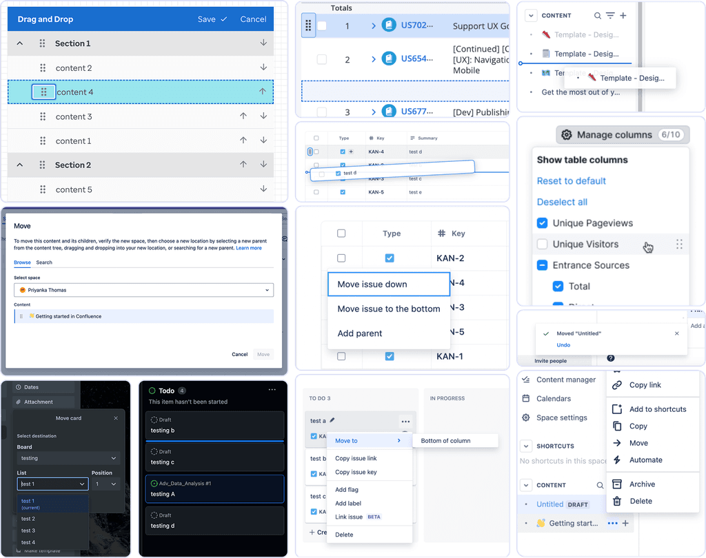
Template — Member profile

Member banner
PATTERNS
ENHANCEMENTS
At-a-glance — name, DOB, and key ID info are always visible
Designed for scanning — layout emphasizes what clinicians need first, without digging
Progressive disclosure — collapsible, with primary information upfront
Member summary
PATTERNS
ENHANCEMENTS
Basic info (left) — holds additional crucial member info & recent notes
Main summary area (middle) — recent / active conditions, allergies, medications, etc.
Reference information (right) — vitals and ADTs persistent, easy to scan
Template — Main workspace

Page header
PATTERNS
ENHANCEMENTS
Displays current and total workflow step(s) for context
Progressive disclosure —collapsible, keeps focus on the task while allowing step review with one click
Call bar
PATTERNS
NEW
Member name always visible throughout workflow
Related actions grouped to improve scan-ability
Main workspace
PATTERNS
NEW
Accommodates single or multi-column layout
Minimizes distractions so clinicians can focus on the task at hand
Tool bar
PATTERNS
NEW
One-click access to reference info from the member summary
Labels appear on hover — improves clarity without visual clutter
Footer (optional)
PATTERNS
NEW
Keeps actions within reach— Primary and secondary actions for current step in workflow always available in sticky footer
Template — Split screen

Split screen
PATTERNS
NEW
Responsive panels allow clinicians to view and interact with two areas at once
Supports multi-tasking within a single workflow, reducing context switching
Tabs
COMPONENTS
NEW
Enables quick reference to multiple categories of member info
Reduces visual clutter without interrupting task flow, using a + button to add tabs as needed
Drag handle
COMPONENTS
NEW
Hover reveals “drag” instructions, addressing usability issues surfaced in testing, making the interaction intuitive for all users
Tap target meets minimum size (24x24) for easy clinician interaction
Interactive line is high-contrast, improving visibility for all users
Takeaways
I learned that systemic complexity demands systemic listening— designing with clinicians, not just for them.
See, this is what we’ve been looking for
— it just does what I need it to do.
Mary Turner, Care Manager
ACCESSIBILITY
DESIGN SYSTEM
CLINICAL
Overview
The drag-and-drop component, used widely in clinical workflows was lacking support for keyboard input, gesture alternatives, and compliant tap targets—creating barriers for users with accessibility needs.
Role: Lead UX Designer
Duration: 2 weeks

Research
I began with a competitive analysis and accessibility audit of common drag-and-drop patterns, including:
Drag handles
Arrows (always visible vs. on hover)
Menu-based reordering
Popovers with number, dropdown, and autocomplete inputs
Each solution was assessed across:
Discoverability and affordance
Suitability for short vs. long lists
WCAG compliance
Screen reader and keyboard support
Findings
Visibility and Accessibility:
Clear indicators and consistent affordances are lacking.; drag-and-drop functionality is often only indicated on hover, which can hinder usability, especially for touchscreen users.
User Feedback:
Snack bar notifications for item movements are commonly used to inform users of actions taken, although not universally implemented.
Keyboard Accessibility:
Most systems do not provide effective keyboard navigation for drag-and-drop actions
Confirmation and Undo Options:
Nonstandard controls (like popover inputs or dropdown menus) benefited from upfront context or usage hints.Interaction Design:
Redundant controls, such as having both arrows and drag icons, lead to unnecessary complexity and increased tabbing.
Testing & Insights
I tested with 6 users across clinical and administrative roles exploring:
Preferences for drag methods
Feedback on spacing and drop indicators
Whether users recognized outline or icon indicators
Understanding of the component's behavior without instruction
Insights
Affordance Must Be Clear
Hidden or hover-only controls lacked visibility, especially for non-gestural users. Clear, persistent affordances were more discoverable.
"I didn’t even see the arrows—thought that was just the handle."
Drag Works for Quick Moves, Not Large Reordering
Dragging was intuitive for short adjustments, but menus or direct input were preferred for moving items long distances.
"Dragging’s fine for one or two spots—if I have to move something from the bottom to the top, it gets annoying."Outlines Alone Aren’t Enough
The outline wasn’t always perceived as a “grab” indicator—users preferred stronger contrast or motion to confirm selection.
"Is that the one I grabbed? I couldn’t tell unless I let go and tried again."Unfamiliar Patterns Needed More Guidance
Nonstandard controls (like popover inputs or dropdown menus) benefited from upfront context or usage hints.
"If there had been a quick hint or tooltip, I probably wouldn’t have struggled."
Final Recommendation
Short/medium lists (<20 items): Arrows or menu

Long lists (>20 items): Popover with autocomplete or dropdown for precise reordering

Accessibility enhancements: Support keyboard, screen reader roles/states, gesture alternatives, and compliant tap targets and color contrast

Measuring success
Keyboard operability (WCAG 2.1.1): Full support for non-gestural users
Screen reader support (ARIA live regions): Real-time updates on drag/drop state
Visual clarity (WCAG 1.4.11, 2.5.5): Compliant tap targets, contrast, and feedback
Dragging movement alternatives (WCAG 2.5.7): Non-gesture methods enabled
PRODUCT
CLINICAL
PLATFORM
STRATEGY & GOVERNANCE
Overview
At Optum, I led a strategic effort to support adoption of Netra AI— an AI-assisted clinical design system built on ShadCN and Radix—to replace the legacy Netra system. The goal: enable teams to move to a React-based, accessible, high-performance component library aligned with company-wide AI and speed-to-market initiatives.
The strategy was to address the following problem— Despite the technical promise of ‘Netra AI,’ conversion was 0% after four months.
Role: Lead UX Designer
Duration: 2 months
Understanding the problem
Through cross-team collaboration and testing, we uncovered three primary blockers:
1. Personal resistance to AI tooling and job displacement fears
2. Poor accessibility and clinical usability in base components
3. High design and development effort for migration without 1:1 component mapping

Accessibility audit
To address low-quality outputs and WCAG gaps:
Conducted a full accessibility audit of the base components

Shared findings with base design system
Provided tokens and styles to support accurate theming + maintained components / patterns critical for clinical use cases in our team library

Reducing conversion effort
To reduce conversion effort:
Created a Netra-to-Netra AI comparison doc to clarify gaps and offer 1:1 alternatives for quick component swapping
Built a Figma component library with linked documentation, roadmaps, and timelines
Led a daily design touchpoint and alternate intake method for team needs

Rebuilding trust
To support team’s training and understanding of AI tools:
Created onboarding resources explaining AI-supported workflows, prompting techniques, and realistic tool limitations
Daily touch base with designers to give teams visibility into roadmap, bugs, and fixes to support team migration planning


Outcomes
Conversion Rate
0% → 80% conversion to Netra AI across product teams
Design Effort
Time to convert per product reduced from ~4,800 hrs to < 2 weeks
Accessibility
WCAG violations addressed — documented and scheduled, withseveral resolved in the shared library
Takeaways
Design constraints require flexibility
Leadership mandated "no customization" of ShadCN apart from styling. I defined a split strategy: adopt base components where possible, maintain custom ones only where needed to meet clinical demands and WCAG.
Accessibility isn’t optional
Many base components failed keyboard navigation, gesture alternatives, and contrast requirements. My audit directly led to fixes in the open-source ShadCN library.
Transparency builds trust
Teams were more willing to convert when they had visibility into the roadmap and clear communication about what was (and wasn’t) ready.
PRODUCT
CONSUMER-FACING
BRANDING
RESEARCH
Overview
Mealify is a consumer-facing, AI-powered meal planning app designed to reduce food waste by helping people make better use of the ingredients they already have. The app turns leftover pantry items into personalized, easy-to-cook meals, simplifying the meal planning process while promoting sustainability, creativity, and convenience.
Why it matters: 30–40% of food in the U.S. is wasted. Most people struggle to plan meals with what’s already in their kitchens. Mealify addressed this by making planning easier, more personalized, and more sustainable.
Role: Founding Designer
Duration: 18 months
Survey
Personas
Busy single dad
College student on a budget
Stay-at-home parent with picky eaters
Novice cook learning at home
Logo
Brand Palette


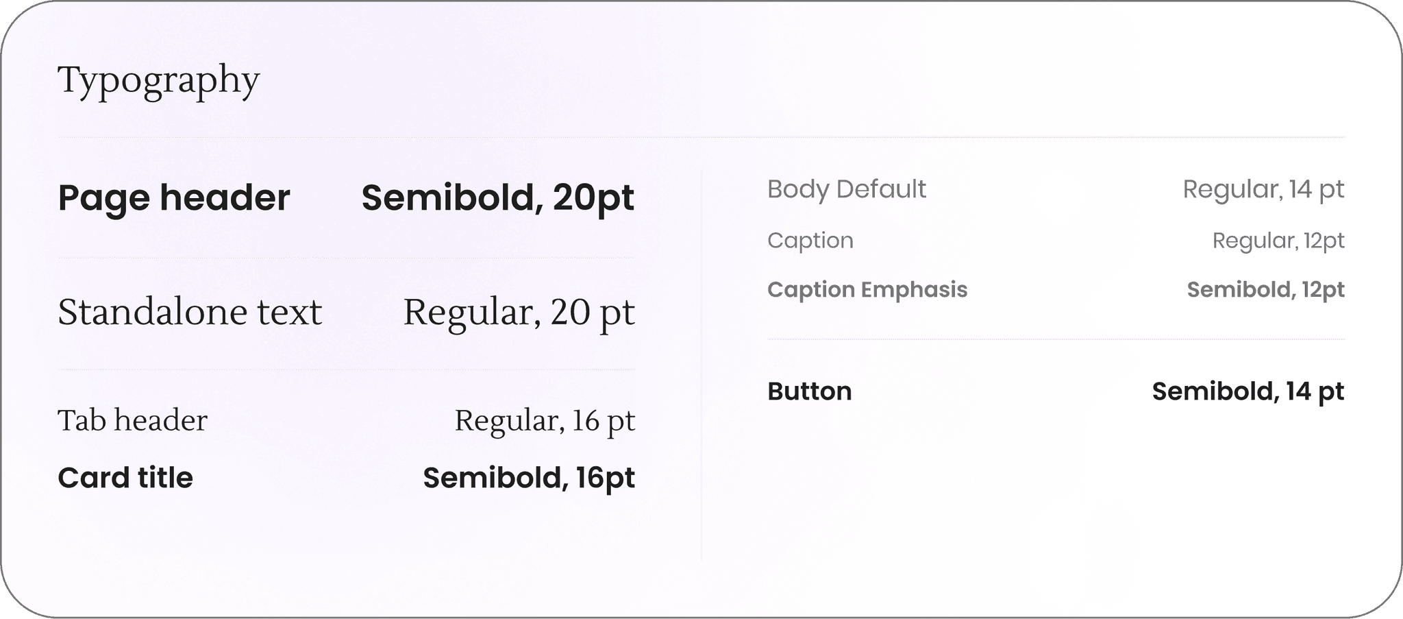
Typography
Onboarding
To personalize the experience from the start, Garrett answers ten questions in under two minutes — focused on cooking habits, household size, dietary needs, kitchen setup, time available, and cuisine preferences.
Garrett is cooking for two, works full time, and needs meals that don't require fancy tools or lots of prep. This initial input shapes everything that follows — from recipe suggestions to pantry guidance.

Testing Pivot — Simplifying Onboarding
User pain point:
The original 15-question onboarding flow felt like too much upfront for users like Garrett, who just wanted to get started.
UX solution:
I reduced onboarding to 10 essential questions, and spaced out the remaining 5 as lightweight prompts throughout the experience (1–2 per day).
Users can also adjust preferences anytime in Settings > Preferences.

Pantry
Pantry Setup
During setup, users choose which categories of ingredients they currently have — like canned goods, frozen, or grains.
Garrett selects what applies, then moves through each category at his own pace. If he skips a common one, the system asks a follow-up ("Are you sure you don’t have any spices?").
This helps make the process faster, while still improving accuracy and reducing guesswork later on.
Testing Pivot — Time estimates
User pain point:
When more than a few items showed up, Garrett felt unsure where to start — or whether he even had time to deal with it.
UX solution:
I added a time estimate at the start of Pantry Check, so users know how long it’ll take to review and act. This sets clearer expectations and makes it easier to commit in the moment.
Pantry Check
To reduce waste, the app prompts a quick “Pantry Check” whenever Garrett returns — surfacing expired or soon-to-expire items and offering simple recipe suggestions that use them. This small touch helps keep things current without overwhelming the user with notifications or upkeep.
Other Features
Pantry organizes by category, sorting by expired + soon expiring items first. Items can be searched + sorted. After initial pantry setup — ingredients are auto-populated after marked from shopped.
Recipes
Recipes Collection
The recipe feed adapts based on Garrett’s preferences and pantry. He can filter by cuisine, time, or whether he has all the ingredients, most, or none.
Cooking Mode
When it’s time to cook, Cooking Mode breaks it down into one step at a time — with large text and voice support to make it easier to follow without needing to touch the screen.
Testing Pivot — Voice support
User pain point:
In the kitchen, messy hands turn a simple tap into a barrier. For users like Garrett, this creates a temporary but real limitation — making it hard to interact with the screen mid-recipe.
UX solution:
I added voice support to Cooking Mode, enabling hands-free interaction through simple prompts like, “Hey Mealify, what’s the next step?” This ensures the experience remains accessible even in high-mess, high-focus moments.
Planner
Meal planning can be done manually or automatically. Garrett sometimes drags meals onto his week, and other times uses auto-generate to build a plan based on what he already has.
It’s flexible by design — changes can be made at any time, and the Planner stays in sync with both the Shopping List and Pantry.
Testing Pivot— Auto-generate
User pain point:
Users with limited time often skipped meal planning altogether. Starting from a blank slate felt like too much, and rigid plans didn’t reflect real-life schedule changes.
UX solution:
I introduced Auto-Generate, which builds a weekly plan based on pantry ingredients and preferences. Users can also drag and drop meals to reschedule — making planning faster, easier, and more adaptable to real life.
Shopping List
The Shopping List builds itself from the weekly plan, but Garrett can also search, filter, and add items manually. Items are grouped by type to make shopping faster, and anything checked off is automatically added back into the Pantry. This keeps everything in sync and reduces time spent managing lists across the app.
Testing Pivot — Adapting to different contexts
User pain point:
At home, the Shopping List was easy to use. But in-store, users like Garrett found it hard to focus — missing items or leaving without everything they needed.
UX solution:
I introduced an optional Shopping Mode with larger text, one section at a time, and a final checklist to catch skipped items. It’s built for busy, high-distraction environments where focus is limited.
Retrospective
If I had more time, I would’ve conducted follow-up interviews to deepen the qualitative insights and test how well the smart planning features aligned with users' mental models. I’d also explore deeper integration with pantry tracking and budgeting tools to help users reduce waste more intuitively.